Showing posts with label 2009 temperatures. Show all posts

Menne et al., JGR 2010: On the reliability of the U.S. Surface Temperature Record

On the reliability of the U.S. Surface Temperature Record

by John Cook, Skeptical Science, January 22, 2010

The website surfacestations.org enlisted an army of volunteers, travelling across the U.S. photographing weather stations. The point of this effort was to document cases of microsite influence -- weather stations located near car parks, air conditioners and airport tarmacs and anything else that might impose a warming bias. While photos can be compelling, the only way to quantify any microsite influence is through analysis of the data. This has been done in On the reliability of the U.S. Surface Temperature Record (Memme 2010), published in the Journal of Geophysical Research. The trends from poorly sited weather stations are compared to well-sited stations. The results indicate that yes, there is a bias associated with poor exposure sites. However, the bias is not what you expect.

Weather stations are split into two categories: good (rating 1 or 2) and bad (ratings 3, 4 or 5). Each day, the minimum and maximum temperature are recorded. All temperature data goes through a process of homogenisation, removing non-climatic influences such as relocation of the weather station or change in the Time of Observation. In this analysis, both the raw, unadjusted data and homogenised, adjusted data are compared. Figure 1 shows the comparison of unadjusted temperature from the good and bad sites. The top figure (c) is the maximum temperature, the bottom figure (d) is the minimum temperature. The black line represents well sited weather stations with the red line representing poorly sited stations.

Maximum and Minimum Temperature Anomaly for good and bad sites
Figure 1. Annual average maximum and minimum unadjusted temperature change calculated using (c) maximum and (d) minimum temperatures from good and poor exposure sites (Menne 2010).

Poor sites show a cooler maximum temperature compared to good sites. For minimum temperature, the poor sites are slightly warmer. The net effect is a cool bias in poorly sited stations. Considering all the air-conditioners, BBQs, car parks and tarmacs, this result is somewhat a surprise. Why are poor sites showing a cooler trend than good sites?

The cool bias occurs primarily during the mid and late 1980s. Over this period, about 60% of USHCN sites converted from Cotton Region Shelters (CRS otherwise known as Stevenson Screens) to electronic Maximum/Minimum Temperature Systems (MMTS). MMTS sensors are attached by cable to an indoor readout device. Consequently, limited by cable length, they're often located closer to heated buildings, paved surfaces and other artificial sources of heat.

Investigations into the impact of the MMTS on temperature data have found that on average, MMTS sensors record lower daily maximums than their CRS counterparts, and, conversely, slightly higher daily minimums (Menne 2009). Only about 30% of the good sites currently have the newer MMTS-type sensors compared to about 75% of the poor exposure locations. Thus, it is the MMTS sensors that are responsible for the cool bias imposed on poor sites.

When the change from CRS to MMTS are taken into account, as well as other biases such as station relocation and Time of Observation, the trend from good sites show close agreement with poor sites.

Maximum and Minimum Temperature Anomaly for good and bad sites
Figure 2: Comparison of U.S. average annual (a) maximum and (b) minimum temperatures calculated using USHCN version 2 adjusted temperatures. Good and poor site ratings are based on surfacestations.org.


Does this latest analysis mean all the work at surfacestations.org has been a waste of time? On the contrary, the laborious task of rating each individual weather station enabled Memme 2010 to identify a cool bias in poor sites and isolate the cause. The role of surfacestations.org is recognised in the paper's acknowledgements in which they "wish to thank Anthony Watts and the many volunteers at surfacestations.org for their considerable efforts in documenting the current site characteristics of USHCN stations."

A net cooling bias was perhaps not the result the surfacestations.org volunteers were hoping for but improving the quality of the surface temperature record is surely a result we should all appreciate.

Link:  http://www.skepticalscience.com/On-the-reliability-of-the-US-Surface-Temperature-Record.html

NYT: Past Decade Warmest Ever, NASA Data Shows


Past Decade Warmest Ever, NASA Data Shows

by John Broder, New York Times, January 22, 2010

WASHINGTON — The decade ending in 2009 was the warmest on record, new surface temperature figures released Thursday by theNational Aeronautics and Space Administration show.
The agency also found that 2009 was the second warmest year since 1880, when modern temperature measurement began. The warmest year was 2005. The other hottest recorded years have all occurred since 1998, NASA said.

James E. Hansen, director of NASA’s Goddard Institute for Space Studies, said that global temperatures varied because of changes in ocean heating and cooling cycles. “When we average temperature over 5 or 10 years to minimize that variability,” said Dr. Hansen, one of the world’s leading climatologists, “we find global warming is continuing unabated.”

A separate preliminary analysis from another NASA office, the National Climatic Data Center, found that 2009 tied with 2006 as the fifth warmest year on record, based on measurements taken on land and at sea. The data center report, published earlier this week, also cited the years 2000 to 2009 as the warmest decade ever measured. The new temperature figures provide evidence in the scientific discussion of global warming but are not likely to be the last word on whether the planet’s temperature is on a consistent upward path.

Dr. Hansen, who has been an outspoken figure in the climate debate for years, has often been attacked by skeptics of global warming for what they charge is selective use of temperature data. The question of whether the planet is heating and how quickly was at the heart of the so-called “climategate” controversy that arose last fall when hundreds of e-mail messages from the climate study unit at the University of East Anglia in England were released without authorization.

Critics seized on the messages as evidence that, in their view, climate scientists were manipulating data and colluding to keep contrary opinion out of scientific journals. But climate scientists and political leaders affirmed what they called a broad-based consensus that the planet was growing warmer, and on a consistent basis, although with measurable year-to-year variations.

The NASA data released Thursday showed an upward temperature trend of about 0.36 °F (0.2 °C) per decade over the past 30 years. Average global temperatures have risen by about 1.5 °F (0.8 °C) since 1880.

“That’s the important number to keep in mind,” said Gavin Schmidt, a climatologist at Goddard. “The difference between the second and sixth warmest years is trivial because the known uncertainty in the temperature measurement is larger than some of the differences between the warmest years.”

Policy makers at the United Nations climate change summit conference in Copenhagen last month agreed on a goal of trying to keep the rise in average global temperatures to 3.6 °F, or 2 °C, to try to forestall the worst effects of global warming.


Link:  http://www.nytimes.com/2010/01/22/science/earth/22warming.html

James Hansen, Reto Ruedy, Makiko Sato, Ken Lo: If It’s That Warm, How Come It’s So Damned Cold?

If it’s that warm, how come it’s so damned cold?

James Hansen, Reto Ruedy, Makiko Sato, Ken Lo

The past year, 2009, tied as the second warmest year in the 130 years of global instrumental temperature records, in the surface temperature analysis of the NASA Goddard Institute for Space Studies (GISS). The Southern Hemisphere set a record as the warmest year for that half of the world.

Global mean temperature, as shown in Figure 1a, was 0.57 °C (1.0 °F) warmer than climatology (the 1951‐1980 base period). Southern Hemisphere mean temperature, as shown in Figure 1b, was 0.49 °C (0.88 °F) warmer than in the period of climatology.

See link for figures -- sorry I cannot copy them from the pdf file -- drat!!!

http://www.columbia.edu/~jeh1/mailings/2010/20100127_TemperatureFinal.pdf
Figure 1. (a) GISS analysis of global surface temperature change. Green vertical bar is estimated 95% confidence range (two standard deviations) for annual temperature change. (b) Hemispheric
temperature change in GISS analysis. (Base period is 1951–1980. This base period is fixed consistently
in GISS temperature analysis papers – see References. Base period 1961–1990 is used for comparison
with published HadCRUT analyses in Figures 3 and 4.)

The global record warm year, in the period of near‐global instrumental measurements (since the late 1800s), was 2005. Sometimes it is asserted that 1998 was the warmest year.

The origin of this confusion is discussed below.

There is a high degree of interannual (year‐to‐year) and decadal variability in both global and hemispheric temperatures. Underlying this variability, however, is a long‐term warming trend that has become strong and persistent over the past three decades.

The long‐term trends are more apparent when temperature is averaged over several years. The 60‐month (5‐year) and 132 month (11‐year) running mean temperatures are shown in Figure 2 for the globe and the hemispheres. The 5‐year mean is sufficient to reduce the effect of the El Nino–La Nina cycles of tropical climate. The 11‐year mean minimizes the effect of solar variability – the brightness of the sun varies by a measurable amount over the sunspot cycle, which is typically of 10–12 years' duration.

Complete paper at this link: http://www.columbia.edu/~jeh1/mailings/2010/20100127_TemperatureFinal.pdf

Joseph Romm: Hansen wants your feedback on “If It’s That Warm, How Come It’s So Damned Cold?”

Hansen wants your feedback on “If It’s That Warm, How Come It’s So Damned Cold?”


Essay by four NASA scientists explains why 2005 (not 1998) was the hottest year, what caused recent cold snap, and the source of the "gullibility" of those "so readily convinced of a false conclusion, that the world is really experiencing a cooling trend"

by Joseph Romm, Climate Progress, January 16, 2010
GLOTI
The bottom line is this: there is no global cooling trend. For the time being, until humanity brings its greenhouse gas emissions under control, we can expect each decade to be warmer than the preceding one. Weather fluctuations certainly exceed local temperature changes over the past half century. But the perceptive person should be able to see that climate is warming on decadal time scales.
The quote and figure are from a fascinating draft essay, “If It’s That Warm, How Come It’s So Damned Cold?” by NASA’s James Hansen, Reto Ruedy, Makiko Sato, and Ken Lo.  It is posted on Hansen’s Columbia University website, and he sent out a note to his email list asking for comments:

Criticisms are welcome. This is a draft essay that I wanted to get out because we are releasing our December and annual surface temperature analysis on the GISS web site. We will prepare a write-up on 2009 temperatures for the GISS web site next week.
If you post comments I’ll get them to him.

Yes, Dr. Ruedy had told me they were going to get their write-up out Friday (see “Breaking: 2009 hottest year on record in Southern Hemisphere and tied for second globally“).  But apparently there are just too many issues they wanted to address in it, including the long-term trend vs. the cold snap.  The trend is unmistakable, you might even say unequivocal:
The long‐term trends are more apparent when temperature is averaged over several years. The 60‐month (5‐year) and 132 month (11‐year) running mean temperatures are shown in Figure 2 for the globe [above] and the hemispheres. The 5‐year mean is sufficient to reduce the effect of the El Nino–La Nina cycles of tropical climate. The 11‐year mean minimizes the effect of solar variability – the brightness of the sun varies by a measurable amount over the sunspot cycle, which is typically of 10–12 years' duration.
The draft essay goes into great depth on how NASA knows 2005 was warmer than 1998 and why their dataset is better than the Hadley/CRU dataset (see also “Why are Hadley and CRU withholding vital climate data from the public?” and Finally, the truth about the Hadley/CRU data: “The global temperature rise calculated by the Met Office’s HadCRUT record is at the lower end of likely warming”).
There is a contradiction between the observed continued warming trend and popular perceptions about climate trends. Frequent statements include: “There has been global cooling over the past decade.” “Global warming stopped in 1998.” “1998 is the warmest year in the record.” Such statements have been repeated so often that most of the public seems to accept them as being true. However, based on our data, such statements are not correct.

The origin of this contradiction probably lies in part in differences between the GISS and HadCRUT temperature analyses (HadCRUT is the joint Hadley Research Centre, University of East Anglia Climate Research Unit temperature analysis). Indeed, HadCRUT finds 1998 to be the warmest year in their record. In addition, popular belief that the world is cooling is reinforced by cold weather anomalies in the United States in the summer of 2009 and cold anomalies in much of the Northern Hemisphere in December 2009.

Here we first show the main reason for the difference between the GISS and HadCRUT analyses. Then we examine the 2009 regional temperature anomalies in the context of global temperatures.
A key takeaway message is this:
Why are some people so readily convinced of a false conclusion, that the world is really experiencing a cooling trend? That gullibility probably has a lot to do with regional short‐term temperature fluctuations, which are an order of magnitude larger than global average annual anomalies.
Short-term weather fluctuations are vastly greater than the long-term global warming anomaly in the climate (so far).  Weather isn’t climate.

Link:  http://climateprogress.org/2010/01/16/hansen-global-warming-cooling-nasa-gisstemp/

Joseph Romm: The hottest decade ends and since there’s no Maunder mininum — sorry deniers! — the hottest decade begins

The hottest decade ends and since there’s no Maunder mininum — sorry deniers! — the hottest decade begins


2009 ends with a "sunspot surge" as solar cycle 24 revs up, though the sun is increasingly a bit player in the global warming trend

by Joseph Romm, Climate Progress, December 31, 2009

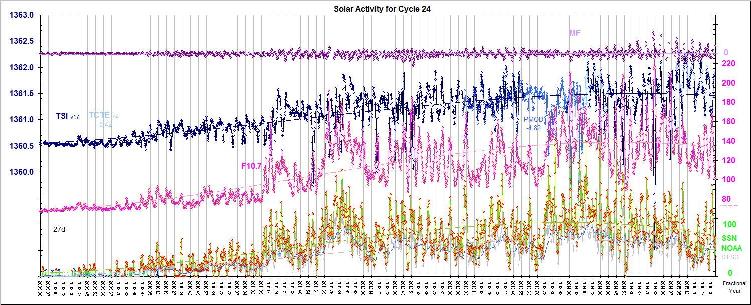
The figure is from Spaceweather.com, in its “Sunspot Surge” post.

The 2000s were  the hottest decade in recorded history by far — even though we’re at “the deepest solar minimum in nearly a century.”  The 2000s were a full 0.2 °C warmer than the 1990s, which of course had been the hottest decade on record, 0.14 °C warmer than 1980s (according to the dataset that best tracks planetary warming).  Hmm.  It’s almost like the warming is accelerating.

There’s little doubt the 2010s will be the hottest decade on record, barring multiple supervolcanoes.  Yet when the anti-science crowd isn’t perversely spending their time trying to stop all efforts to cut global warming pollution that might slow warming, they are perversely trying to convince the public and policymakers we’re not warming at all.  That’s why many of them have been rooting for this deep solar minimum to become a Maunder Minimum, to mute the warming signal and hence the motivation for action for a few more years.  Yes, they have a self-destructive streak.

In fact, even if total solar irradiance (TSI) never recovered, we wouldn’t have entered a period of cooling since, “the negative forcing, relative to the mean solar irradiance is equivalent to seven years of CO2 increase at current growth rates,” as NASA noted in January 2009.  Heck, even with a La Niña and an unusually inactive sun, 2008 was almost 0.1 °C warmer than the hot decade of the 1990s as a whole.  And 2009 now seems likely to be the second hottest year on record after 2005.  Changes in the sun just ain’t the big dog anymore when it comes to driving climate change (see below).

When we last looked at the sun [please, don't try that at home], NASA was reporting that the sunspot cycle was about to come out of its depression, if a newly discovered mechanism for predicting solar cycles — a migrating jet stream deep inside the sun — proved accurate (see National Solar Observatory, NASA say no “Maunder Minimum”).

It now appears TSI is well on its way to recovering, as NASA and others had predicted.  Leif Svalgaard recently put up this figure (click to enlarge):
http://www.leif.org/research/TSI-SORCE-2008-now.png
Spaceweather.com says of its sunspot figure at the top of the page:
The dark line is a linear least-squares fit to the data. If the trend continues exactly as shown (prediction: it won’t), sunspots will become a non-stop daily occurrence no later than February 2011. Blank suns would cease and solar minimum would be over.

If the past two years have taught us anything, however, it is that the sun can be tricky and unpredictable. Stay tuned for surprises.
Even as Solar Cycle 24 picks up, it won’t affect global temperatures quickly.  Again, as  NASA explained in January:
Because of the large thermal inertia of the ocean, the surface temperature response to the 10-12 year solar cycle lags the irradiance variation by 1-2 years. Thus, relative to the mean, i.e., the hypothetical case in which the sun had a constant average irradiance, actual solar irradiance will continue to provide a negative anomaly for the next 2-3 years.
Also, Solar Cycle 24 has recently been predicted to be on the wimpy side.

The sun simply isn’t a big player in driving recent warming.  As a major 2009 study found (see Another long-debunked denier talking point is debunked again: Changes in the Sun are not causing global warming):
According to this analysis, solar forcing contributed negligible long-term warming in the past 25 years and 10% of the warming in the past 100 years.
And a major 2007 study concluded:
Here we show that over the past 20 years, all the trends in the Sun that could have had an influence on the Earth’s climate have been in the opposite direction to that required to explain the observed rise in global mean temperatures.
Related scientific studies on the subject can be found on the excellent debunking website, Skeptical Science.  Here’s but a few:
  • Erlykin 2009: “We deduce that the maximum recent increase in the mean surface temperature of the Earth which can be ascribed to solar activity is 14% of the observed global warming”
  • Benestad 2009: “Our analysis shows that the most likely contribution from solar forcing a global warming is 7 ± 1% for the 20th century and is negligible for warming since 1980.”
  • Lockwood 2008: “It is shown that the contribution of solar variability to the temperature trend since 1987 is small and downward; the best estimate is −1.3% and the 2σ confidence level sets the uncertainty range of −0.7 to −1.9%.”
  • Lockwood 2008: “The conclusions of our previous paper, that solar forcing has declined over the past 20 years while surface air temperatures have continued to rise, are shown to apply for the full range of potential time constants for the climate response to the variations in the solar forcings.”
  • Ammann 2007: “Although solar and volcanic effects appear to dominate most of the slow climate variations within the past thousand years, the impacts of greenhouse gases have dominated since the second half of the last century.”
  • Lockwood 2007: “The observed rapid rise in global mean temperatures seen after 1985 cannot be ascribed to solar variability, whichever of the mechanism is invoked and no matter how much the solar variation is amplified.”
  • Foukal 2006 concludes “The variations measured from spacecraft since 1978 are too small to have contributed appreciably to accelerated global warming over the past 30 years.”
By one recent estimate, human-caused greenhouse gas emissions are responsible for “80 to 120% of the warming” in recent decades (see “What percentage of global warming is due to human causes vs. natural causes?“)

Human-caused emissions are simply driving climate change to dangerous levels with forcings that dwarf previous natural forcings both in speed and scale (see “Humans boosting CO2 14,000 times faster than nature, overwhelming slow negative feedbacks“).

And that’s why the time to act is now, so every decade this century isn’t the hottest decade on record, with unimaginably catastrophic consequences for the health and well-being of our children and grandchildren and their children and grandchildren.

Link: http://climateprogress.org/2009/12/31/science-the-hottest-decade-ends-maunder-mininum-solar-cycle-24-global-warming/

Satellite Data Confirms November Warmth over the U.S.; Current Decade Likely Warmest in the Modern Record

Readers, I am borrowing this post from Brett Anderson at AccuWeather since I can only get this graph by asking someone outside of Brazil to send it to me -- the servers at this website will never let me in.  The second graphic is the scariest graphic on global warming that I have ever seen and continues to be although I have been looking at its updates for two years.


You can see the cyclical patterns of the the circulation of the warm and cooler ocean waters, and how over time, the waters are no longer cooling.  Not good.


Satellite Data Confirms November Warmth over the U.S.

by Brett Anderson, AccuWeather, Sunday, December 6, 2009

Remote Sensing Systems (RSS) has released their satellite measured, lower tropospheric temperature anomaly data for the month of November across the globe.

A global look at the lower tropospheric temperature anomalies across most of the globe, courtesy of RSS.


Overall, November ended up slightly warmer compared to normal globally, but the bigger story is how warm November was compared to normal from central to northeastern North America.

Other "warm" pockets can be seen over southeastern Australia, Scandinavia and out over the central Pacific, which is a reflection of the slowly strengthening El Nino.

Notable "cool" spots showed up over southern South America, Asia and Alaska.

Let's look at the actual numbers (temperature anomalies)............
Global (70 S to 82.5 N): +.328 °C
Continental U.S.: +1.242 °C, which makes this the warmest month compared to normal since March of 2007 and the warmest November since 2001. Based on the RSS temperature record going back to 1979.

Here is an updated look at the decadal trend of the lower tropospheric temperature anomaly by latitude. Note: A majority of the warming has been in the northern polar regions (increasing oranges/reds).

Also, note (circled) the distinct red (warming) in the lower latitudes during 1998 (strong El Nino) and the latest cooling in this same region during 2008 with the La Nina.


Current Decade Likely Warmest in the Modern Record

by Brett Anderson, AccuWeather, December 8, 2009

The current decade will probably end up as the warmest (combined land and sea surface) in the modern record globally, according to the World Meteorological Organization (WMO). Records go back to 1850.
The decade of the 2000s (2000-2009) was warmer than the 1990s, which in turn was warmer than the 1980s, according to the WMO press release that was issued today.

This preliminary information for 2009 is based on climate data from networks of land-based weather and climate stations, ships and buoys, as well as satellites.

Image courtesy of the World Meteorological Organization.


How about 2009?
This year will likely rank in the top 10 warmest since records were kept, and may end up as the 5th warmest.

--Only North America experienced cooler than normal conditions this year.

--Large parts of southern Asia and central Africa are likely to have their warmest year on record.
---------
The WMO global temperature analysis is based on three complementary datasets. One is the combined dataset maintained by both the Hadley Centre of the UK Met Office and the Climatic Research Unit, University of East Anglia, United Kingdom. Another dataset is maintained by the National Oceanic and Atmospheric Administration (NOAA) under the United States Department of Commerce, and the third one is from the Goddard Institute of Space Studies (GISS) operated by the National Aeronautics and Space Administration (NASA).

Link:  http://global-warming.accuweather.com/

World Meteorological Organization: 2000–2009, THE WARMEST DECADE

Press Release No. 869

For use of the information media
Not an official record


2000–2009, THE WARMEST DECADE

Geneva, 8 December 2009 (WMO) – The year 2009 is likely to rank in the top 10 warmest on record since the beginning of instrumental climate records in 1850, according to data sources compiled by the World Meteorological Organization (WMO). The global combined sea surface and land surface air temperature for 2009 (January–October) is currently estimated at 0.44°C ± 0.11°C (0.79°F ± 0.20°F) above the 1961–1990 annual average of 14.00°C/57.2°F. The current nominal ranking of 2009, which does not account for uncertainties in the annual averages, places it as the fifth-warmest year. The decade of the 2000s (2000–2009) was warmer than the decade spanning the 1990s (1990–1999), which in turn was warmer than the 1980s (1980–1989). More complete data for the remainder of the year 2009 will be analysed at the beginning of 2010 to update the current assessment.

This year above-normal temperatures were recorded in most parts of the continents. Only North America (United States and Canada) experienced conditions that were cooler than average. Given the current figures, large parts of southern Asia and central Africa are likely to have the warmest year on record.

Climate extremes, including devastating floods, severe droughts, snowstorms, heatwaves and cold waves, were recorded in many parts of the world. This year the extreme warm events were more frequent and intense in southern South America, Australia and southern Asia, in particular. La Niña conditions shifted into a warm-phase El Niño-Southern Oscillation (ENSO) in June. The Arctic sea ice extent during the melt season ranked the third lowest, after the lowest and second-lowest records set in 2007 and 2008, respectively.

This preliminary information for 2009 is based on climate data from networks of land-based weather and climate stations, ships and buoys, as well as satellites. The data are continuously collected and disseminated by the National Meteorological and Hydrological Services (NMHSs) of the 189 Members of WMO and several collaborating research institutions. The data continuously feed three main depository global climate data and analysis centres, which develop and maintain homogeneous global climate datasets based on peer-reviewed methodologies. The WMO global temperature analysis is thus based on three complementary datasets. One is the combined dataset maintained by both the Hadley Centre of the UK Met Office and the Climatic Research Unit, University of East Anglia, United Kingdom. Another dataset is maintained by the National Oceanic and Atmospheric Administration (NOAA) under the United States Department of Commerce, and the third one is from the Goddard Institute of Space Studies (GISS) operated by the National Aeronautics and Space Administration (NASA). The content of the WMO statement is verified and peer-reviewed by leading experts from other international, regional and national climate institutions and centres before its publication.

Final updates and figures for 2009 will be published in March 2010 in the annual WMO Statement on the Status of the Global Climate.

Regional temperature anomalies
The year 2009 (January–October) was again warmer than the 1961–1990 average all over Europe and the Middle East. China had the third-warmest year since 1951; for some regions 2009 was the warmest year. The year started with a mild January in northern Europe and large parts of Asia, while western and central Europe were colder than normal. Russia and the Great Lakes region in Canada experienced colder-than- average temperatures in February and January, respectively. Spring was very warm in Europe and Asia; April in particular was extremely warm in central Europe. Germany, the Czech Republic and Austria reported temperature anomalies of more than +5°C, breaking the previous records for the month in several locations.

The European summer was also warmer than the long-term average, particularly over the southern regions.

Spain had the third-warmest summer, with hotter summers reported only in 2003 and 2005. Italy recorded a strong heatwave in July, with maximum temperatures above 40°C, and some local temperatures reaching 45°C. A heatwave at the beginning of July affected the United Kingdom, France, Belgium and Germany, and some stations in Norway experienced new maximum temperature records.

India had an extreme heatwave event during May, which caused 150 deaths. A heatwave hit northern China during June, with daily maximum temperatures above 40°C; historical maximum temperature records were broken for the summer in some locations.

In late July many cities across Canada recorded their warmest daily temperatures. Vancouver and Victoria set new records, reaching 34.4°C and 35.0°C, respectively. Alaska also had the second-warmest July on record. Conversely, October was a very cold month across large parts of the United States. For the nation as a whole, it was the third-coolest October on record, with an average temperature anomaly of -2.2°C (-4.0°F). Similarly, a very cold October was reported in Scandinavia, with mean temperature anomalies ranging from -2°C to -4°C.

The austral autumn (March to May) was extremely warm in Argentina, Uruguay, Paraguay and southern Brazil. With daily temperatures ranging from 30°C to 40°C, several records were broken during this season. By the end of October, an extreme weather situation affected north and central Argentina, producing unusually high temperatures (above 40°C). Conversely, November was abnormally cold in the southern part of the region, with some rare and late snowfalls.

So far, Australia has had the third-warmest year on record. The year 2009 was marked by three exceptional heatwaves, which affected south-eastern Australia in January/February and November, and subtropical eastern Australia in August. The January/February heatwave was associated with disastrous bushfires that caused more than 173 fatalities. Victoria recorded its highest temperature with 48.8°C. The northern region experienced a cold summer, however, with anomalies reaching -3°C to -4°C in some places. Winter was exceptionally mild over much of Australia. Maximum temperatures were well above normal across the entire continent, reaching 6°C to 7°C above normal in some parts. The national maximum temperature anomaly of +3.2°C was the largest ever recorded for any month.

Severe droughts
China suffered its worst drought in five decades. Water levels in parts of the Gan River and Xiangjiang River were the lowest in the past 50 years. In India the poor monsoon season caused severe drought impacts in 40 per cent of the districts. The north-western and north-eastern parts of the country were badly affected. It was reported to be one of the weakest monsoon seasons since 1972.

In East Africa the drought led to massive food shortages. In Kenya the drought was responsible for severe damage to livestock and a 40% decline in the maize harvest.

In North America, Mexico experienced severe-to-exceptional drought conditions by the month of September. In the United States, the western region was the most affected by a moderate-to-exceptional drought by the end of October. Nevertheless, the total area affected by drought in the United States during October was the second-smallest value recorded in this decade.

Drought in Central Argentina caused severe damage to agriculture, livestock and water resources. The situation was most severe at the end of October, with very high temperatures reported as well.

Over the key agricultural areas of the Murray-Darling Basin and the south-western part of Western Australia, rainfall was generally below normal. The passage of another year without any sustained above-normal rainfall has seen long-term rainfall deficits continuing in south-eastern Australia. Sustained dry conditions in the Murray-Darling Basin have now continued for nine years.

Intense storm events and precipitation
At the end of January, Spain and France were severely affected by winter storm Klaus, the worst extra-tropical storm in a decade, with winds similar to a category 3 hurricane. Another winter storm combined with heavy snowfall caused severe damage in western Europe and resulted in serious disruptions of air and rail traffic in several countries. In late spring and summer a large number of thunderstorms with heavy rain, hail and tornadoes caused local flooding and significant damage across Germany. In September, several parts of the Mediterranean region were affected by extreme rainfall events. Total rainfall of more than 300mm was recorded in less than 48 hours in one location of south-eastern Spain, where the long-term average for total annual precipitation does not exceed 450 mm. During the same month, intense rainfall caused devastating damage to infrastructure in several parts of northern Africa, including Algeria, Morocco and Tunisia. In a similar pattern, the highest September rainfall recorded in 80 years produced severe flash floods in north-western Turkey. November brought severe flooding to northern areas of the United Kingdom, and a new 24-hour precipitation record was set for the country.

During the beginning of the year heavy rainfall was observed in Colombia, producing landslides and widespread floods. North-east Brazil was severely affected by heavy rainfall and flooding in April and May. Later, in July, a severe snowstorm hit the southern part of Argentina; it was the worst snowstorm in 15 years. During the austral spring, particularly in November, continuous heavy and intense rainfall was seen in north-eastern Argentina, southern Brazil and Uruguay, causing flooding in many places and affecting more than 15,000 people. Total monthly precipitation records were broken, with rainfall exceeding more than 500mm in many locations.

In Canada, Ontario experienced a record number of witnessed tornadoes and a record number of related fatalities. Canadian avalanches were almost double the yearly average for the past decade and the worst since 2002–2003. A total of 25 deaths made it one of the deadliest seasons. The northern plains region of the United States was affected by record flooding during the month of March. As a whole, the United States recorded the wettest October in 115 years.

In Central America, an intense storm in El Salvador in November, associated in part with Hurricane Ida, produced deadly floods and landslides that claimed 192 lives.

In Asia, after the weak 2009 monsoon season, southern India recorded severe flooding due to incessant rain in late September and the first week of October, and more than 250 lives were lost. On the other hand, northern China was severely affected by a snowstorm that occurred during the first half of November as part of a strong cold wave. These snowfalls were one month earlier than normal, breaking local weather records.

In western Africa, heavy and intense rainfall in September caused flooding that affected more than 100,000 people. The worst flooding was observed in Burkina Faso, where 263 mm of rain was recorded in less than 12 hours, breaking a record set 90 years ago. Further south on the continent, nearly 1 million people in Zambia and Namibia were affected by torrential rain that caused rivers to overflow their banks, flooding homes and cropland.

Australia was also affected by local flooding. Coastal Queensland and New South Wales were the hardest hit by several heavy rain events, with daily rainfall totals in excess of 300 mm. On the other hand, numerous duststorms affected eastern Australia in the second half of September and early October, as regular strong winds transported dust from northern South Australia over the eastern states. The most severe duststorm occurred on 22–23 September and covered large parts of New South Wales and Queensland, where the visibility was reduced to 100–200m in both Sydney and Brisbane.

End of La Niña and Development of El Niño
La Niña-like conditions were present in early 2009, followed by the development of El Niño patterns starting in June 2009. During June–September 2009, sea surface temperatures were generally about 1°C warmer than the long-term average across the central and eastern equatorial Pacific. An El Niño event is currently underway, with the early phase of the event holding steady at weak-to-moderate levels through July–September. During October, almost all indicators of El Niño became noticeably stronger.

Tropical cyclone season
The 2009 Atlantic hurricane season closed with the fewest named storms and hurricanes since 1997, most likely due to the unfavourable cyclonic conditions caused in part by El Niño. A total of nine named tropical storms were formed, including three hurricanes, two of which were major hurricanes at Category 3 strength or higher. (The averages are 11, 6 and 2, respectively).

In the East Pacific, 20 named tropical storms were recorded, eight of which evolved into hurricanes and five of which became major hurricanes (The averages are 16, 9 and 4, respectively.)

In the western North Pacific, 22 named tropical storms have been recorded so far, and 13 of them reached the intensity of typhoon, compared to the long-term averages of 27 and 14, respectively. Heavy precipitation associated with typhoons Ketsana and Parma was observed across the south of Luzon Island in the Philippines. The resulting flood disaster caused more than 900 fatalities in total. In August, Typhoon Morakot swept across Taiwan Province of China and caused more than 400 deaths and severe damage to agriculture and infrastructure. Hundreds of roads and bridges on the island were destroyed by floods.

The Australian and South Indian Ocean cyclone seasons recorded near-average activity. In the Australian region, there were 10 systems during this season, with Hamish the most significant one, although it did not make landfall. It reached category 5 intensity and was the most intense cyclone observed off the eastern Queensland coast since 1918.

Third-lowest Arctic sea ice
According to scientific measurements, Arctic sea ice has declined dramatically over the past 30 years at least, with the most extreme decline seen in the summer melt season. Arctic sea ice extent during the 2009 melt season was 5.10 million km2, which is the third-lowest on record after the 2007 record (4.3 million km2) and 2008 (4.67 million km2), since satellite measurements began in 1979.

Tamino's Open Mind: Riddle me this... (RSS UAH GISS global temps from 1979 thru 2009)

Riddle me this …

by Tamino [this guy is a national treasure!], Open Mind, December 7, 2009 · 52 Comments

Those who are in denial of global warming insist that the last decade of global temperature contradicts what was expected by mainstream climate scientists.

Here’s global temperature data from NASA GISS before the 21st century, for the time span 1975 to 2000:

I’ve computed and plotted a trend line using linear regression. In addition, I’ve plotted dashed lines two standard deviations above and below the trend line — we expect most of the data to fall within these dashed lines. Finally, I’ve projected those lines out to the present day.
That’s what mainstream climate scientists expected to happen.
Here’s what actually happened.

Gosh. What actually happened is exactly what was expected. Exactly. By mainstream climate scientists. You know, those folks who keep telling us that human activity is warming the planet and that it’s dangerous.
What’s that? You don’t trust NASA GISS? You think they faked it, or it’s all just urban heat islands? How about satellite data from RSS — there’s no urban heat island effect there!

Hmm. What actually happened is exactly what was expected. Exactly. By mainstream climate scientists.
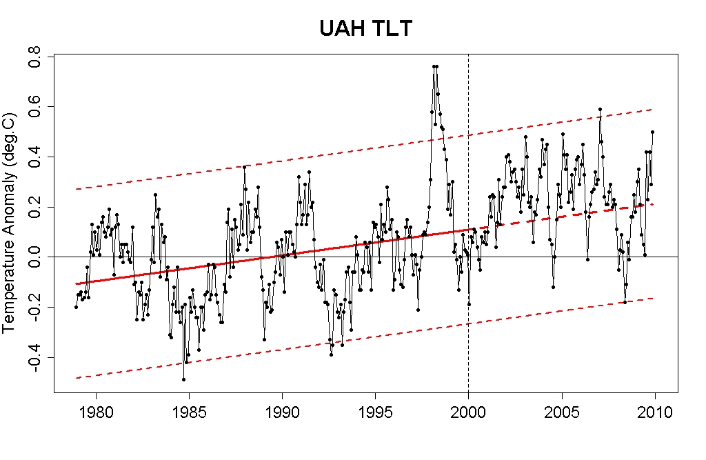
Don’t trust the people at RSS? How about the denialists’ favorite data, satellite estimates from UAH?

Golly!

We’re only 10 years into the 21st century, but so far, global temperature has done exactly what was expected by mainstream climate scientists. Exactly. You know — those folks who keep telling us that human activity is warming the planet, and that it’s very dangerous.

This is undeniable. Unless of course you’re in denial.

Yet people continue to deny it. They tell you it’s all a hoax, and to support that idea they repeatedly claim that the last decade of temperature data contradicts global warming.
Riddle me this: why can’t they get something this simple right?

UPDATE

Kevan Hashemi submitted this comment:
You picked the period 1980 to 2000 do you would get a positive slope. Why not fit a line to 2000 to 2010? Because it shows a negative slope and you don’t want that? Well, that’s precisely the point skeptics are making: if you look at the last 10 years, the trend is zero or down. You choose your own 20 years to show the trend is up. If you chose 1940 t0 1980 the trend would be down. In 1999 climate scientists told us the world would warm up over the next ten years. It didn’t.

You are wrong on all counts.

The trend lines from 2000 to 2010 (actually to the present since 2009 hasn’t ended yet) are all positive:

  • For GISS data, the trend from 2000 to the present is +0.0115 +/- 0.018 deg.C/yr.

  • For RSS data, the trend from 2000 to the present is +0.0017 +/- 0.030 deg.C/yr.

  • For UAH data, the trend from 2000 to the present is +0.0052 +/- 0.043 deg.C/yr. Notice all those plus signs.

    More to the point, the uncertainties in trend estimates using just data since 2000 are much larger than the trend estimates themselves. Attempting to delineate the climate trend using so little data is a fool’s exercise.

    That’s the point. They’re trying to fool you.

    As for “warming since 1999″:

  • Using GISS data the decadal average for the 1990s was its highest yet at 0.3176. For the 2000s it warmed considerably, averaging 0.5108.

  • Using RSS data the decadal average for the 1990s was its highest yet at 0.0833. For the 2000s it warmed considerably, averaging 0.2384.

  • Using UAH data the decadal average for the 1990s was its highest yet at 0.0587. For the 2000s it warmed considerably, averaging 0.2219.
    Finally — with GISS data I started at 1975 because that’s a natural turning point in the temperature trend, and data since 1975 actually does enable us to estimate a trend with sufficient precision to be useful (unlike your suggestion of starting with 2000). For RSS and UAH data I started at 1979 because that’s all the data there is.

    Link:  http://tamino.wordpress.com/2009/12/07/riddle-me-this/

  • Charles J. Hanley: Decade of 2000s was warmest ever, scientists say

    Decade of 2000s was warmest ever, scientists say

    It dawned with the warmest winter on record in the United States. And when the sun sets this New Year's Eve, the decade of the 2000s will end as the warmest ever on global temperature charts.

    Warmer still, scientists say, lies ahead.

    Through 10 years of global boom and bust, of breakneck change around the planet, of terrorism, war and division, all people everywhere under that warming sun faced one threat together: the buildup of greenhouse gases, the rise in temperatures, the danger of a shifting climate, of drought, weather extremes and encroaching seas, of untold damage to the world humanity has created for itself over millennia.

    As the decade neared its close, the U.N. gathered presidents and premiers of almost 100 nations for a "climate summit" to take united action, to sharply cut back the burning of coal and other fossil fuels.

    Secretary-General Ban Ki-moon told them they had "a powerful opportunity to get on the right side of history" at a year-ending climate conference in Copenhagen.

    Once again, however, disunity might keep the world's nations on this side of making historic decisions.

    "Deep down, we know that you are not really listening," the Maldives' Mohamed Nasheed told fellow presidents at September's summit.

    Nasheed's tiny homeland, a sprinkling of low-lying islands in the Indian Ocean, will be one of the earliest victims of seas rising from heat expansion and melting glaciers. On remote islets of Papua New Guinea, on Pacific atolls, on bleak Arctic shores, other coastal peoples in the 2000s were already making plans, packing up, seeking shelter.

    The warming seas were growing more acid, too, from absorbing carbon dioxide, the biggest greenhouse gas in an overloaded atmosphere. Together, warmer waters and acidity will kill coral reefs and imperil other marine life — from plankton at the bottom of the food chain, to starfish and crabs, mussels and sea urchins.

    Over the decade's first nine years, global temperatures averaged 0.6 °C (1.1 degrees F) higher than the 1951-1980 average, NASA reported. And temperatures rose faster in the far north than anyplace else on Earth.
    The decade's final three summers melted Arctic sea ice more than ever before in modern times. Greenland's gargantuan ice cap was pouring 3 percent more meltwater into the sea each year. Every summer's thaw reached deeper into the Arctic permafrost, threatening to unlock vast amounts of methane, a global-warming gas.
    Less ice meant less sunlight reflected, more heat absorbed by the Earth. More methane escaping the tundra meant more warming, more thawing, more methane released.
    At the bottom of the world, late in the decade, International Polar Year research found that Antarctica, too, was warming. Floating ice shelves fringing its coast weakened, some breaking away, allowing the glaciers behind them to push ice faster into the rising oceans.
    On six continents the glaciers retreated through the 2000s, shrinking future water sources for countless millions of Indians, Chinese, South Americans. The great lakes of Africa were shrinking, too, from higher temperatures, evaporation and drought. Across the temperate zones, flowers bloomed earlier, lakes froze later, bark beetles bored their destructive way northward through warmer forests. In the Arctic, surprised Eskimos spotted the red breasts of southern robins.
    In the 2000s, all this was happening faster than anticipated, scientists said. So were other things: By late in the decade, global emissions of carbon dioxide matched the worst case among seven scenarios laid down in 2001 by the Intergovernmental Panel on Climate Change, the U.N. scientific network formed to peer into climate's future. Almost 29 billion tons of the gas poured skyward annually — 23 percent higher than at the decade's start.
    By year-end 2008, the 2000s already included eight of the 10 warmest years on record. By 2060, that trajectory could push temperatures a dangerous 4 degrees C (7 degrees F) or more higher than preindustrial levels, British scientists said.
    Early in the decade, the president of the United States, the biggest emitter, blamed "incomplete" science for the U.S. stand against rolling back emissions, as other industrial nations were trying to do. As the decade wore on and emissions grew, American reasoning leaned more toward the economic.
    By 2009, with a new president and Congress, Washington seemed ready to talk. But in the front ranks of climate research — where they scale the glaciers, drill into ocean sediments, monitor a changing Earth through a web of satellite eyes — scientists feared they were running out of time.

    Before the turn of the last century, with slide rule, pencil and months of tedious calculation, Svante Arrhenius was the first to show that carbon dioxide would warm the planet — in 3,000 years. The brilliant Swede hadn't foreseen the 20th century explosion in use of fossil fuels.

    Today their supercomputers tell his scientific heirs a much more urgent story: To halt and reverse that explosion of emissions, to head off a planetary climate crisis, the 10 years that dawn this Jan. 1 will be the fateful years, the final chance, the last decade.
    ___
    Charles J. Hanley has covered climate issues for The Associated Press since the Kyoto conference of 1997.

    Link:  http://news.yahoo.com/s/ap/decade_s_end_climate/

    Australian temperatures break records in the extreme in November 2009

    Australia in November 2009

    In Brief

    November 2009 was an exceptionally warm month in south-eastern Australia. Records were broken throughout the region for both maximum and minimum temperature, and New South Wales and Victoria both broke the previous record for the largest mean temperature anomaly ever recorded for an Australian state, with anomalies of +4.61°C and +4.36°C respectively. While conditions were less extreme elsewhere, it was still Australia’s hottest November on record with a mean temperature anomaly of +1.87°C. Rainfall averaged over the continent was slightly below normal, with a major rain event late in the month in the southern inland offsetting dry conditions elsewhere, especially in the tropics.

    Temperatures

    Maximum temperatures averaged over Australia were 2.12°C above normal, ranking second behind the 2006 record of +2.17°C. They were at least 2°C above normal throughout New South Wales and Victoria, South Australia except for the far north, and Tasmania except for the east coast, with similar anomalies also occurring along the south coast of Western Australia east of Albany, and on the west coast near Carnarvon and Broome. In the south-east anomalies were much more extreme, and were mostly in the +5-7°C range in South Australia south of Port Pirie, Victoria away from the coast, and inland New South Wales except the far west. Statewide anomalies set records in NSW, Victoria and Tasmania, with the first two (+4.99 and +4.92°C respectively) exceeding the previous largest anomaly recorded for an Australian state. Station records were set over an area covering all of Victoria, inland New South Wales except the far north-west, the east coast south of Sydney, most agricultural areas of South Australia, and north-western Tasmania. Records were also set locally around Broome and east of Darwin.

    Only a few areas had below-normal maximum temperatures, the most significant being on the Queensland coast between Mackay and Cooktown, with anomalies locally reaching −1°C around Townsville. They were also locally below normal near the Gulf of Carpentaria, and in the inland Pilbara in Western Australia.
    Minimum temperatures averaged over Australia were the highest on record (1.61°C above normal). Again the abnormal warmth was concentrated in the south-east with state anomalies setting records in New South Wales, Victoria and South Australia (for the first two states it was a record anomaly for any month). Mean minima were at least 2°C above normal throughout those three states (except for the far north of South Australia) and in Tasmania outside the far south, as well as in southern inland Queensland and locally in the southern Northern Territory and south-eastern Western Australia. Anomalies were in the +4-6°C range in most of inland New South Wales and northern Victoria, and adjacent areas of eastern South Australia. Records were set in most of Victoria except for west Gippsland, as well as in south-western New South Wales and most of the settled areas of South Australia.

    Below-normal minimum temperatures, as for maxima, were confined to the tropics, most notably the Queensland coast and adjacent inland north of Rockhampton (except for parts of Cape York Peninsula); anomalies reached −1°C around Charters Towers. Minima were also below normal in the north-eastern Northern Territory, and in parts of the Kimberley.

    Areal average temperatures
      Maximum Temperature Minimum Temperature

    Rank
    (out of 60)
    Anomaly*
    (°C)
    Comment Rank
    (out of 60)
    Anomaly*
    (°C)
    Comment
    Australia 59 +2.12 2nd highest; record is +2.17 (2006) 60 +1.61 Highest on record; previous record +1.31 (1959)
    Queensland 53 +1.28
    53 +0.97
    New South Wales 60 +4.99 Highest on record; previous record +4.03 (2002) 60 +4.22 Highest on record; previous record +2.73 (1959)
    Victoria 60+4.92 Highest on record; previous record +3.82 (1982) 60 +3.81 Highest on record; previous record +2.69 (2000)
    Tasmania 60 +3.18 Highest on record; previous record +2.45 (2007) 59 +1.68 2nd highest; record is +2.42 (2000)
    South Australia 59 +3.05 2nd highest; record is +3.10 (1982) 60 +3.36 Highest on record; previous record +2.31 (2000)
    Western Australia 57 +1.71
    52 +0.85
    Northern Territory 52 +0.99
    46 +0.60
    *Anomaly is the departure from the long-term (1961-1990) average.

    Link:  http://www.bom.gov.au/climate/current/month/aus/summary.shtml

    Michael Schlesinger, a climatologist at the University of Illinois, explains why he sees the disclosed e-mails as a complete distraction from the body of evidence pointing to a human hand on the planet’s thermostat

    From the Dot Earth blog at the New York Times online:

    Michael Schlesinger, a climatologist at the University of Illinois, explains why he sees the disclosed e-mails as a complete distraction from the body of evidence pointing to a human hand on the planet’s thermostat:
    I would like to make the following contribution to your blog regarding the recent desperate, the-end-justifies-the-means act of stealing e-mails from the Climate Research Unit (CRU) of the University of East Anglia, U.K.
    1. CRU is not the only group in the world that is tracking the change in global-average near-surface temperature. There are at least three other groups, two in the U.S. (the National Oceanic and Atmospheric Administration, NOAA; and the National Aeronautics and Space Administration, NASA), and one in Japan (Japan Meteorological Agency, JMA).
    2. As presented below, the temperature record of each of these groups (available at the URLs given at the bottom of this message) shows the same features: (i) a warming of about 0.9 °C (1.6 °F) over the past 150 years and (ii) natural variability with both short and long periods.
    PhotoMichael Schlesinger / University of Illinois Trends in global temperature estimated by four different research groups are very similar, both in charting pronounced warming and a lot of short-term variability. The groups are the National Oceanic and Atmospheric Administration, NASA, Britain’s Hadley Center and Climatic Research Unit (Univ. of East Anglia) and Japan’s meteorological agency.
    3. In our year-2000 published analysis of these data through 1997 ( Causes of Global Temperature Changes During the 19th and 20th Centuries, Geophysical Research Letters, 27:14, 2137-2140; Natalia Andronova & Michael Schlesinger), we showed that this warming was predominantly due to people. An update of that analysis, which includes the observations since 1997, shows that the observed warming is overwhelmingly due to people.

    4. Each of the four records above shows cooling in recent years. But, as is shown in these records, this recent cooling is nothing new. It was because of the likelihood of such a cooling that we concluded in our year-2000 paper referenced above that:
    “… it is prudent not to expect continued year-after-year warming in the near future and, in so doing, diminish concern about global warming should global cooling instead manifest itself again.”
    The absolute worst thing that humanity could do is mistake a short-term natural cooling for the absence of human-caused global warming and, in so doing, not transition as soon as economically possible from the fossil fuel age to the post-fossil fuel age.
    To make this mistake would leave a legacy of global warming for our children, grandchildren and multiple generations thereafter which they likely could not reverse, and for which they would likely not forgive us.
    This we must not do.
    Data Sources:  NOAA,  NASA,  HADCRU (Hadley Centre/Climatic Research Unit), JMA (Japan Meteorological Agency), English pages  here and here, Japanese page translated into English.
    Link:  http://dotearth.blogs.nytimes.com/2009/11/30/more-on-the-climate-files-and-climate-trends/#more-11467

    Combined Global Land and Marine Surface Temperatures: 1850-2008, & wrt October 2009


    The time series shows the combined global land and marine surface temperature record from 1850 to 2008. The year 2008 was tenth warmest on record, exceeded by 1998, 2005, 2003, 2002, 2004, 2006, 2001, 2007 and 1997.

    Link:  http://www.cru.uea.ac.uk/cru/info/warming/

    With respect to October 2009:


    Link:  http://hadobs.metoffice.com/hadcrut3/

    2009 predicted to be in the top 5 warmest years on record, perhaps the top 3

    This year 'in top five warmest'

    by Roger Harrabin, Environment analyst, BBC News, November 24, 2009

    Winter sun (Getty Images)
    Some sources say this year could be the third warmest on record
    This year will be one of the top five warmest years globally since records began 150 years ago, according to figures compiled by the Met Office.

    The UK's weather service projects that, unless there is an exceptionally cold spell before the end of the year, temperatures will be up on last year.

    Climate sceptics had pointed out that the temperature rise appeared to have stalled in the last decade or so.

    That was caused in part by the Pacific La Nina current, which cools the Earth.

    But the influence of La Nina declined in the spring and the Met Office project that, barring a very cold December, this year will be the fifth warmest on record.

    Other sources say it could even be the third warmest.

    The last ten years have been in the top 15 warmest on record. And this summer the UK enjoyed temperatures higher than the long-term average.

    Although the Met Office was pilloried after forecasting a "barbecue summer", it was their rainfall forecast, not the projected temperatures, that was wrong.

    Next year we will see the influence of the warming El Nino current, and the Met Office says there is a 50% chance that global temperatures will hit an all-time high.

    Joseph Romm: Record high temperatures far outpace record lows across U.S.

    Record high temperatures far outpace record lows across U.S.

    by Joseph Romm, Climate Progress, November 14, 2009
    Spurred by a warming climate, daily record high temperatures occurred twice as often as record lows over the last decade across the continental United States, new research shows. The ratio of record highs to lows is likely to increase dramatically in coming decades if emissions of greenhouse gases continue to climb.
    temps
    This graphic shows the ratio of record daily highs to record daily lows observed at about 1,800 weather stations in the 48 contiguous United States from January 1950 through September 2009. Each bar shows the proportion of record highs (red) to record lows (blue) for each decade. The 1960s and 1970s saw slightly more record daily lows than highs, but in the last 30 years record highs have increasingly predominated, with the ratio now about two-to-one for the 48 states as a whole.  (©UCAR, graphic by Mike Shibao.)
    This is from the news release of the National Center for Atmospheric Research (NCAR).  The scientific paper itself is here (subs. req’d).  A blog post on this by the NYT’s Andy Revkin is here.  And NCAR posted a video of lead author Gerald Meehl discussing his findings:


    Here are more excerpts from the news release:
    “Climate change is making itself felt in terms of day-to-day weather in the United States,” says Gerald Meehl, the lead author and a senior scientist at the National Center for Atmospheric Research (NCAR). “The ways these records are being broken show how our climate is already shifting.”
    … If temperatures were not warming, the number of record daily highs and lows being set each year would be approximately even. Instead, for the period from January 1, 2000, to September 30, 2009, the continental United States set 291,237 record highs and 142,420 record lows, as the country experienced unusually mild winter weather and intense summer heat waves.
    A record daily high means that temperatures were warmer on a given day than on that same date throughout a weather station’s history. The authors used a quality control process to ensure the reliability of data from thousands of weather stations across the country, while looking at data over the past six decades to capture longer-term trends.
    This decade’s warming was more pronounced in the western United States, where the ratio was more than two to one, than in the eastern United States, where the ratio was about one-and-a-half to one.
    The study also found that the two-to-one ratio across the country as a whole could be attributed more to a comparatively small number of record lows than to a large number of record highs. This indicates that much of the nation’s warming is occurring at night, when temperatures are dipping less often to record lows. This finding is consistent with years of climate model research showing that higher overnight lows should be expected with climate change.
    And that is in keeping with what the scientific models had predicted.  Given that the past projections were right, we should have more confidence in the future ones:
    The modeling results indicate that if nations continue to increase their emissions of greenhouse gases in a “business as usual” scenario, the U.S. ratio of daily record high to record low temperatures would increase to about 20-to-1 by mid-century and 50-to-1 by 2100. The mid-century ratio could be much higher if emissions rose at an even greater pace, or it could be about 8-to-1 if emissions were reduced significantly, the model showed.
    The authors caution that such predictions are, by their nature, inexact. Climate models are not designed to capture record daily highs and lows with precision, and it remains impossible to know future human actions that will determine the level of future greenhouse gas emissions. The model used for the study, the NCAR-based Community Climate System Model, correctly captured the trend toward warmer average temperatures and the greater warming in the West, but overstated the ratio of record highs to record lows in recent years.
    The scientists made use of an extensive dataset in this analysis:
    The study team analyzed several million daily high and low temperature readings taken over the span of six decades at about 1,800 weather stations across the country, thereby ensuring ample data for statistically significant results. The readings, collected at the National Oceanic and Atmospheric Administration’s National Climatic Data Center, undergo a quality control process at the data center that looks for such potential problems as missing data as well as inconsistent readings caused by changes in thermometers, station locations, or other factors.
    Bottom line:  We’re still warming, as the science predicted.

    Link:  http://climateprogress.org/2009/11/14/ncar-science-record-high-temperatures-outpace-record-lows/

    Seth Borenstein: In hot water -- world sets ocean temperature record in August 2009

    In hot water: World sets ocean temperature record (Update)

    by Seth Borenstein, AP Science Writer, August 20, 2009

    The water temperature was 72 °F -- more like Ocean City, Md., this time of year. And Ocean City's water temp hit 88 °F, toasty even by Miami Beach standards.


    Kramer, 26, who lives in the seaside town of Scarborough, said it was the first time he's ever swam so long in Maine's coastal waters.

    It's not just the ocean off the Northeast coast that is super-warm this summer. July was the hottest the world's oceans have been in almost 130 years of record-keeping.

    The average water temperature worldwide was 62.6 °F, according to the National Climatic Data Center, the branch of the U.S. government that keeps world weather records. June was only slightly cooler, while August could set another record, scientists say. The previous record was set in July 1998 during a powerful El Nino.

    Meteorologists said there's a combination of forces at work: A natural El Nino weather pattern just getting started on top of worsening man-made global warming, and a dash of random weather variations. The resulting ocean heat is already harming threatened coral reefs. It could also hasten the melting of Arctic sea ice and help hurricanes strengthen.

    The Gulf of Mexico, where warm water fuels hurricanes, has temperatures dancing around 90 °F. Most of the water in the Northern Hemisphere has been considerably warmer than normal. The Mediterranean is about three degrees warmer than normal. Higher temperatures rule in the Pacific and Indian Oceans.

    The phenomena is most noticeable near the Arctic, where water temperatures are as much as 10 °F above average. The tongues of warm water could help melt sea ice from below and even cause thawing of ice sheets on Greenland, said Waleed Abdalati, director of the Earth Science and Observation Center at the University of Colorado.

    Breaking heat records in water is more ominous as a sign of global warming than breaking temperature marks on land, because water takes longer to heat up and does not cool off as easily as land.

    "This warm water we're seeing doesn't just disappear next year; it'll be around for a long time," said climate scientist Andrew Weaver of the University of Victoria in British Columbia. It takes five times more energy to warm water than land.

    The warmer water "affects weather on the land," Weaver said. "This is another yet really important indicator of the change that's occurring."

    Georgia Institute of Technology atmospheric science professor Judith Curry said water is warming in more places than usual, something that has not been seen in more than 50 years.

    Add to that an unusual weather pattern this summer where the warmest temperatures seem to be just over oceans, while slightly cooler air is concentrated over land, said Deke Arndt, head of climate monitoring at the climate data center.

    The pattern is so unusual that he suggested meteorologists may want to study that pattern to see what's behind it.

    The effects of that warm water are already being seen in coral reefs, said C. Mark Eakin, coordinator of the National Oceanic and Atmospheric Administration's coral reef watch. Long-term excessive heat bleaches colorful coral reefs white and sometimes kills them.

    Bleaching has started to crop up in the Florida Keys, Puerto Rico and the Virgin Islands. Typically, bleaching occurs after weeks or months of prolonged high water temperatures. That usually means September or even October in the Caribbean, said Eakin. He found bleaching in Guam Wednesday. It's too early to know if the coral will recover or die. Experts are "bracing for another bad year," he said.

    The problems caused by the El Nino pattern are likely to get worse, the scientists say.

    An El Nino occurs when part of the central Pacific warms up, which in turn changes weather patterns worldwide for many months. El Nino and its cooling flip side, La Nina, happen every few years.

    During an El Nino, temperatures on water and land tend to rise in many places, leading to an increase in the overall global average temperature. An El Nino has other effects, too, including dampening Atlantic hurricane formation and increasing rainfall and mudslides in Southern California.

    Warm water is a required fuel for hurricanes. What's happening in the oceans "will add extra juice to the hurricanes," Curry said.

    Hurricane activity has been quiet for much of the summer, but that may change soon, she said. Hurricane Bill quickly became a major storm and the National Hurricane Center warned that warm waters are along the path of the hurricane for the next few days.

    Hurricanes need specific air conditions, so warmer water alone does not necessarily mean more or bigger storms, said James Franklin, chief hurricane specialist at the National Hurricane Center in Miami.

    Link:  http://www.physorg.com/news169993833.html

    Seth Borenstein: Global cooling rejected by statisticians

    Statisticians reject global cooling

    Some skeptics claim Earth is cooling despite contrary data

    by Seth Borenstein, AP Science Writer, October 26, 2009


    WASHINGTON - An analysis of global temperatures by independent statisticians shows the Earth is still warming and not cooling as some global warming skeptics are claiming.

    The analysis was conducted at the request of The Associated Press to investigate the legitimacy of talk of a cooling trend that has been spreading on the Internet, fueled by some news reports, a new book and temperatures that have been cooler in a few recent years.

    In short, it is not true, according to the statisticians who contributed to the AP analysis.

    The statisticians, reviewing two sets of temperature data, found no trend of falling temperatures over time.

    2005 hottest year recorded

    U.S. government data show the decade that ends in December will be the warmest in 130 years of record-keeping, and 2005 was the hottest year recorded.

    The case that the Earth might be cooling partly stems from recent weather. Last year was cooler than previous years. It has been a while since the superhot years of 1998 and 2005. So is this a longer climate trend or just weather's normal ups and downs?

    In a blind test, the AP gave temperature data to four independent statisticians and asked them to look for trends, without telling them what the numbers represented. The experts found no true temperature declines over time.

    "If you look at the data and sort of cherry-pick a microtrend within a bigger trend, that technique is particularly suspect," said John Grego, a professor of statistics at the University of South Carolina.

    Yet the idea that things are cooling has been repeated in opinion columns, a BBC news story posted on the Drudge Report and in a new book by the authors of the best-seller "Freakonomics." Last week, a poll by the Pew Research Center found that only 57% of Americans now believe there is strong scientific evidence for global warming, down from 77% in 2006.

    Global warming skeptics base their claims on an unusually hot year in 1998. Since then, they say, temperatures have dropped — thus, a cooling trend. But it is not that simple.

    Temps rising once more

    Since 1998, temperatures have dipped, soared, fallen again and are now rising once more. Records kept by the British meteorological office and satellite data used by climate skeptics still show 1998 as the hottest year. However, data from the National Oceanic and Atmospheric Administration and NASA show 2005 has topped 1998. Published peer-reviewed scientific research generally cites temperatures measured by ground sensors, which are from NOAA, NASA and the British, more than the satellite data.

    The recent Internet chatter about cooling led NOAA's climate data center to re-examine its temperature data. It found no cooling trend.

    "The last 10 years are the warmest 10-year period of the modern record," said NOAA climate monitoring chief Deke Arndt. "Even if you analyze the trend during that 10 years, the trend is actually positive, which means warming."

    The AP sent expert statisticians to analyze NOAA's year-to-year ground temperature changes over 130 years and the 30 years of satellite-measured temperatures preferred by skeptics and gathered by scientists at the University of Alabama in Huntsville.

    Statisticians who analyzed the data found a distinct decades-long upward trend in the numbers, but could not find a significant drop in the past 10 years in either data set. The ups and downs during the last decade repeat random variability in data as far back as 1880.

    Saying there's a downward trend since 1998 is not scientifically legitimate, said David Peterson, a retired Duke University statistics professor and one of those analyzing the numbers.

    Identifying a downward trend is a case of "people coming at the data with preconceived notions," said Peterson, author of the book "Why Did They Do That? An Introduction to Forensic Decision Analysis."

    Satellite data tends to be cooler

    One prominent skeptic said that to find the cooling trend, the 30 years of satellite temperatures must be used. The satellite data tends to be cooler than the ground data. Key to that is making sure that 1998 is part of the trend, he added.

    What happened within the past 10 years or so is what counts, not the overall average, contends Don Easterbrook, a Western Washington University geology professor and global warming skeptic.

    "I don't argue with you that the 10-year average for the past 10 years is higher than the previous 10 years," said Easterbrook, who has self-published some of his research. "We started the cooling trend after 1998. You're going to get a different line depending on which year you choose.

    "Should not the actual temperature be higher now than it was in 1998?" Easterbrook asked. "We can play the numbers games."

    That's the problem, some of the statisticians said.

    Grego produced three charts to show how choosing a starting date can alter perceptions. Using the skeptics' satellite data beginning in 1998, there is a "mild downward trend," he said. But doing that is "deceptive."

    Conflicting data analyses

    The trend disappears if the analysis is begun in 1997. And it trends upward if you begin in 1999, he said.
    Apart from the conflicting data analyses is the eyebrow-raising new book title from Steven D. Levitt and Stephen J. Dubner, "Super Freakonomics: Global Cooling, Patriotic Prostitutes and Why Suicide Bombers Should Buy Life Insurance."

    A line in the book says: "Then there's this little-discussed fact about global warming: While the drumbeat of doom has grown louder over the past several years, the average global temperature during that time has in fact decreased."

    That led to a sharp rebuke from the Union of Concerned Scientists, which said the book mischaracterizes climate science with "distorted statistics."

    Levitt, a University of Chicago economist, said he does not believe there is a cooling trend. He said the line was just an attempt to note the irony of a cool couple of years at a time of intense discussion of global warming. Levitt said he did not do any statistical analysis of temperatures but "eyeballed" the numbers and noticed 2005 was hotter than the last couple of years. Levitt said the "cooling" reference in the book title refers more to ideas about trying to cool the Earth artificially.

    Moving averages over 10 years important

    Statisticians say that in sizing up climate change, it's important to look at moving averages of about 10 years. They compare the average of 1999-2008 to the average of 2000-2009. In all data sets, 10-year moving averages have been higher in the last five years than in any previous years.

    "To talk about global cooling at the end of the hottest decade the planet has experienced in many thousands of years is ridiculous," said Ken Caldeira, a climate scientist at the Carnegie Institution at Stanford University.
    Ben Santer, a climate scientist at the Department of Energy's Lawrence Livermore National Lab, called it "a concerted strategy to obfuscate and generate confusion in the minds of the public and policy-makers" ahead of international climate talks in December in Copenhagen.

    President Barack Obama weighed in on the topic Friday at the Massachusetts Institute of Technology. He said some opponents "make cynical claims that contradict the overwhelming scientific evidence when it comes to climate change, claims whose only purpose is to defeat or delay the change that we know is necessary."
    Early this year, climate scientists in two peer-reviewed publications statistically analyzed recent years' temperatures against claims of cooling and found them invalid.

    Not all skeptical scientists make the flat-out cooling argument.

    "It pretty much depends on when you start," wrote John Christy, the Alabama atmospheric scientist who collects the satellite data that skeptics use. He said in an e-mail that looking back 31 years, temperatures have gone up nearly 0.75 °F (0.4 °C). The last dozen years have been flat, and temperatures over the last eight years have declined a bit, he wrote.

    Oceans influence short-term weather

    Oceans, which take longer to heat up and longer to cool, greatly influence short-term weather, causing temperatures to rise and fall temporarily on top of the overall steady warming trend, scientists say. The biggest example of that is El Nino.

    El Nino, a temporary warming of part of the Pacific Ocean, usually spikes global temperatures, scientists say. The two recent warm years, both 1998 and 2005, were El Nino years. The flip side of El Nino is La Nina, which lowers temperatures. A La Nina bloomed last year and temperatures slipped a bit, but 2008 was still the ninth hottest in 130 years of NOAA records.

    Of the 10 hottest years recorded by NOAA, eight have occurred since 2000, and after this year it will be nine because this year is on track to be the sixth-warmest on record.

    The current El Nino is forecast to get stronger, which probably will pushing global temperatures even higher next year, scientists say. NASA climate scientist Gavin Schmidt predicts 2010 may break a record, so a cooling trend "will be never talked about again."